Creating a premium product range for a household name
Following on from our success with the initial Mark Hill project in 2018, the team approached us again and tasked us with creating and developing a premium salon range for new Mark Hill hair products.
Insight and research revealed that the younger Mark Hill consumer would still remain loyal to the brand, if they had a more premium offering that appealed to the customer who was growing up. The other side to this aspect was that a more premium offering would also help bring in new customers to the brand. We needed to achieve two important things, attract new customers and retain brand loyalists.
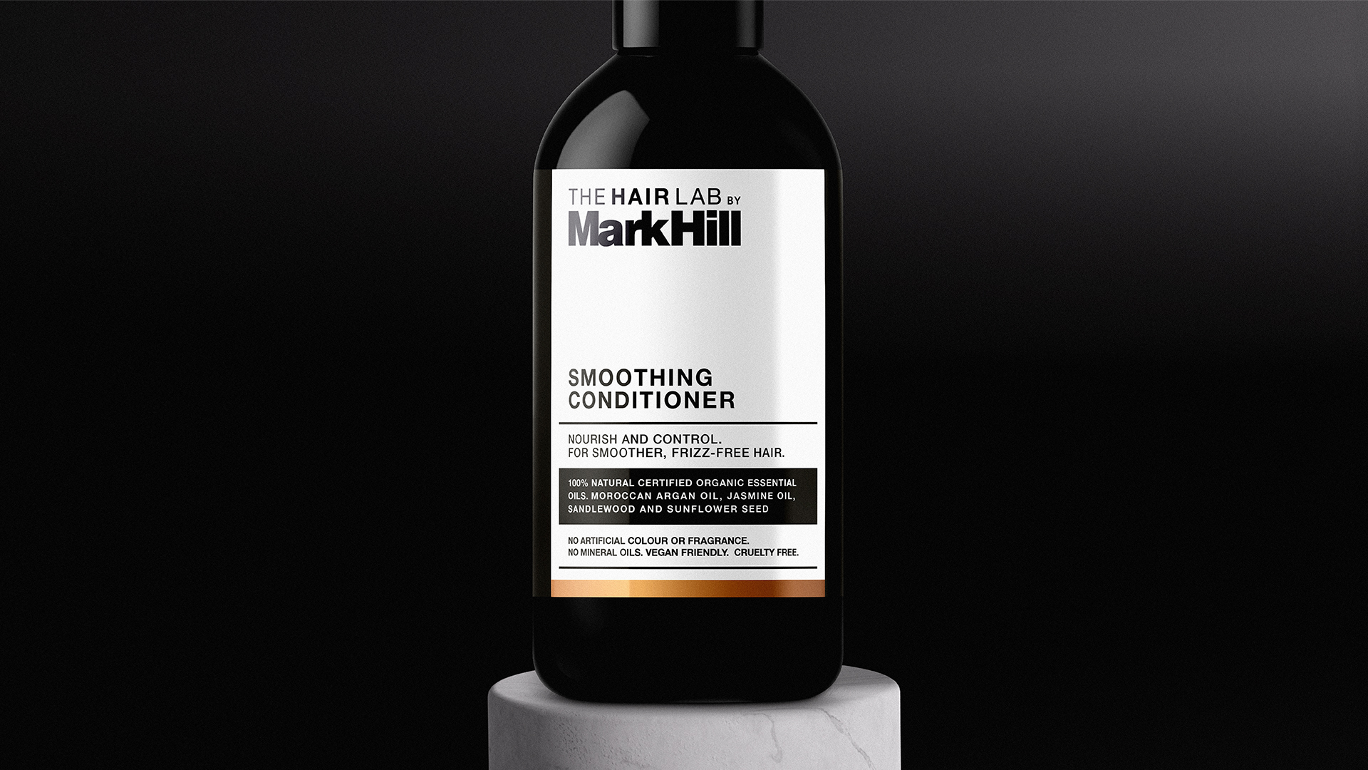
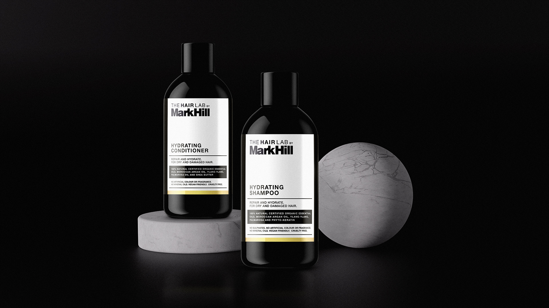
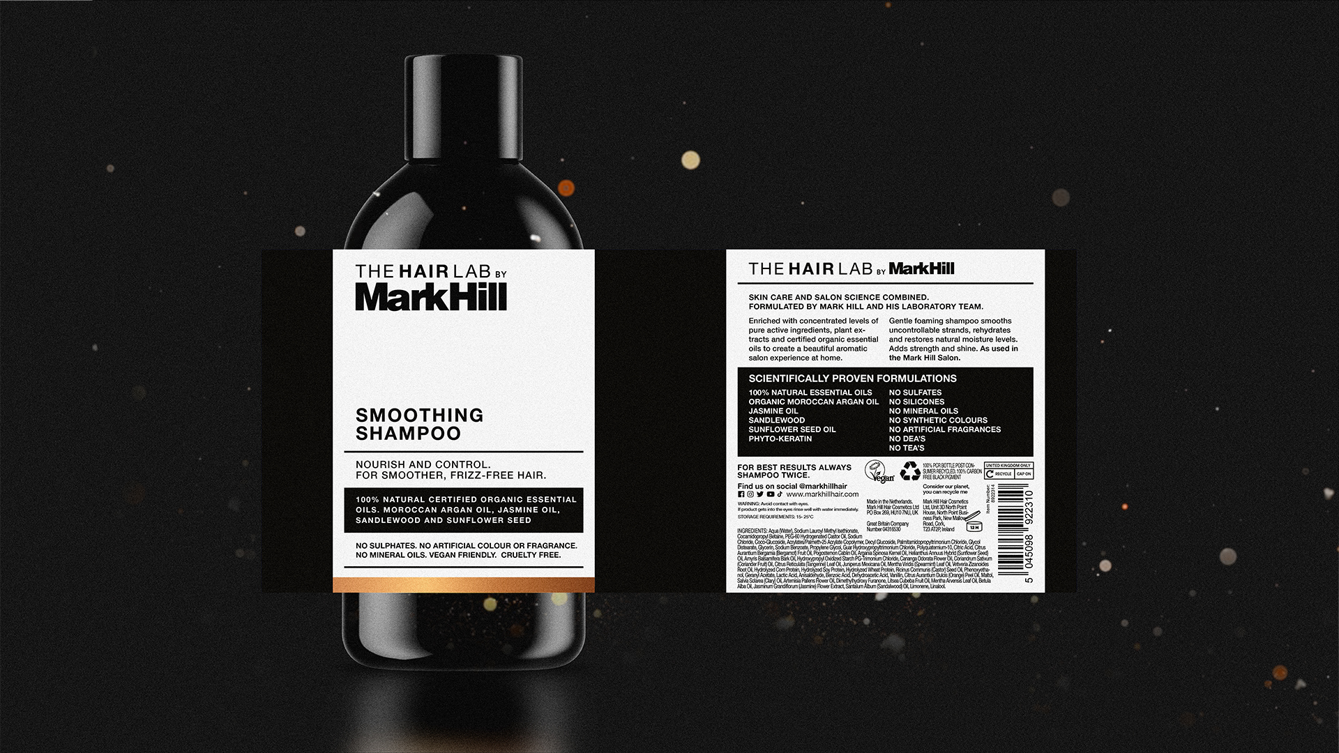
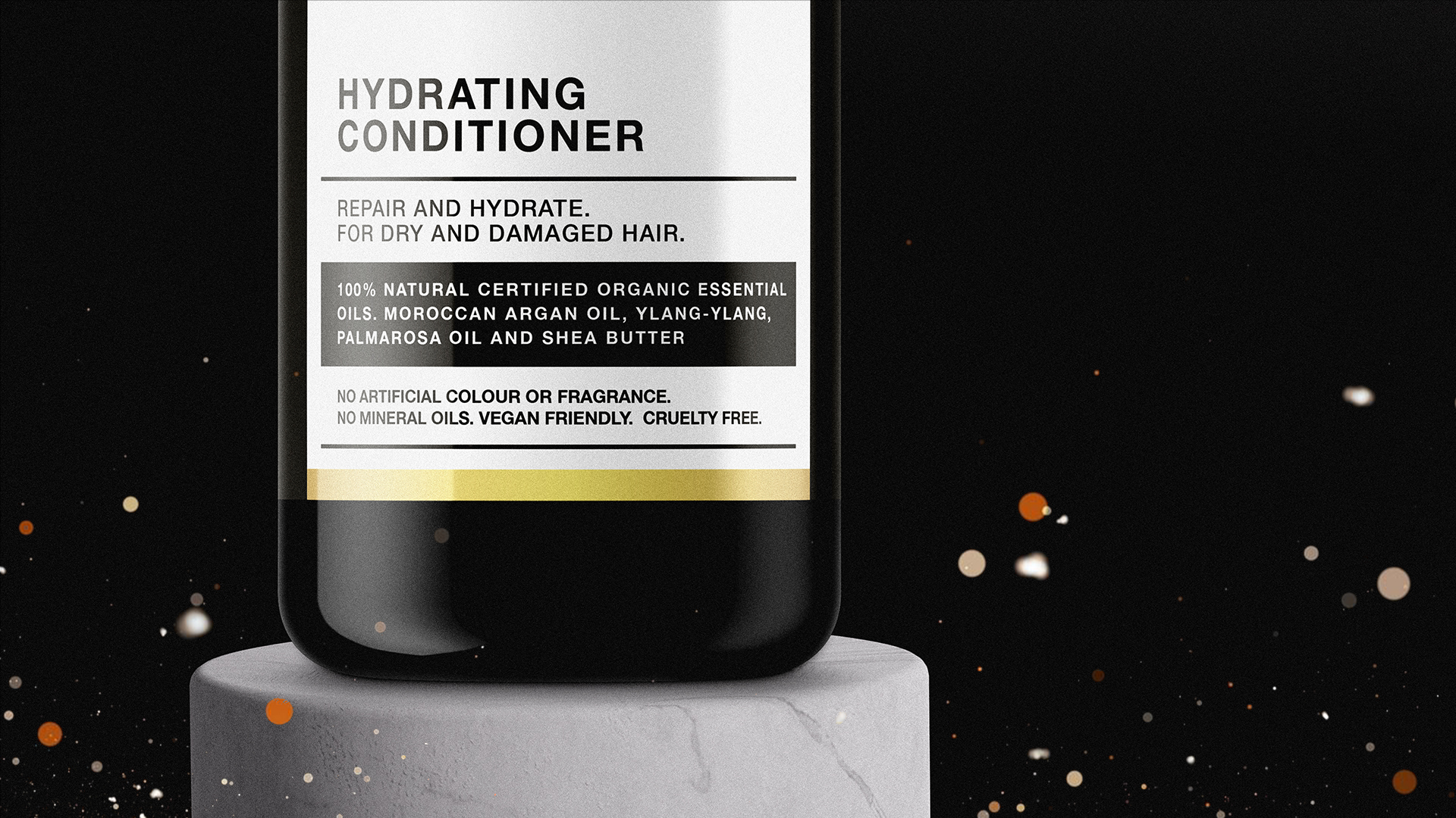
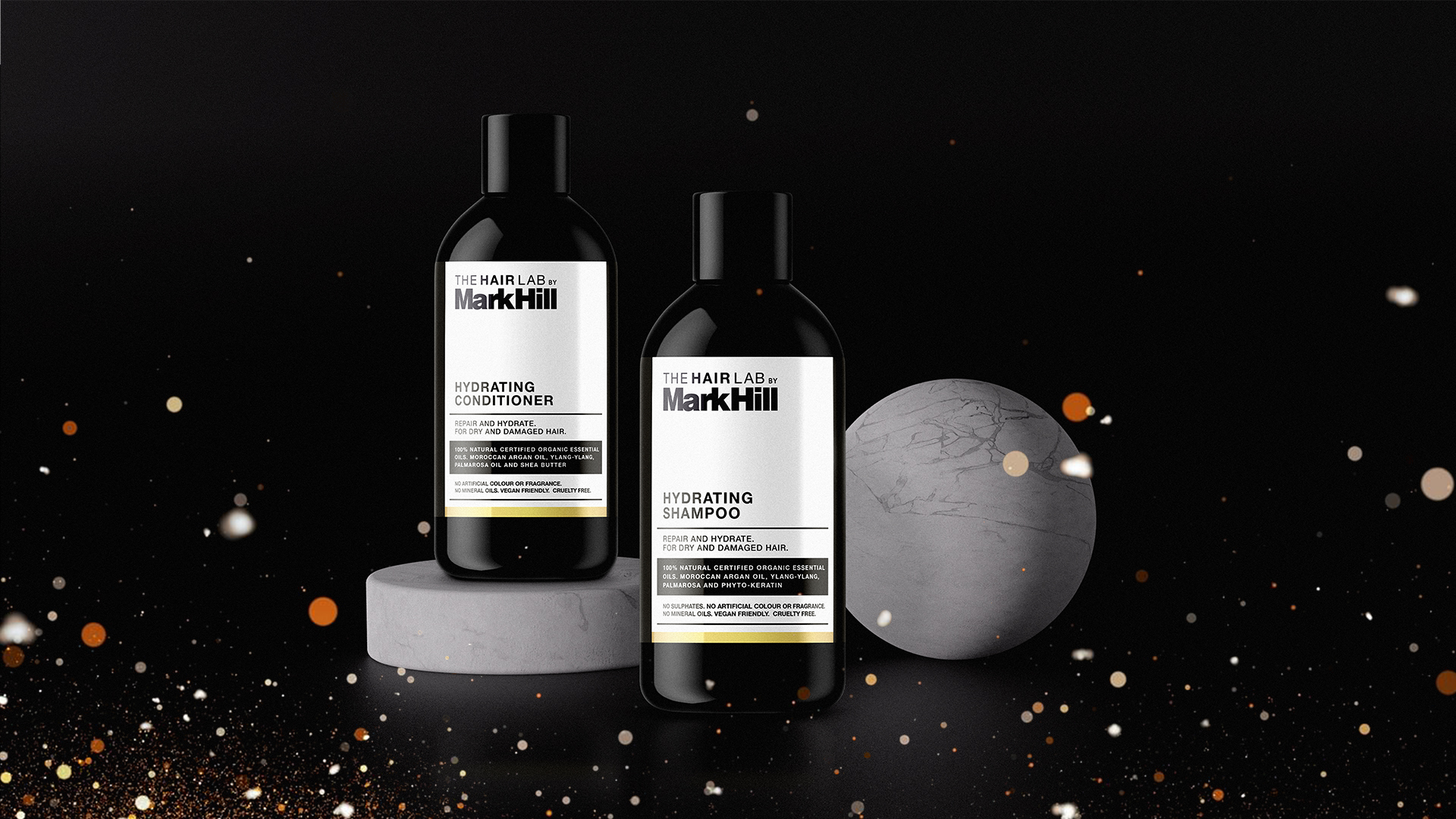
We decided to name this new offering the HairLab range. Given the objectives of the range, the success of it relied heavily on the look and feel of the packaging. For this reason we decided to break away from the usual Mark Hill look of bright colours and trend lead design, by creating a high-end premium range that was minimal in style but full of substance. We stripped it right back to black and white with the addition of metallics, to help differentiate the various lines within the range.
The visual relied heavily on typography – we opted for a type choice that wouldn't look out of place in a salon or lab. It had to reflect it's professional roots, something that could be trusted and relied on, no fads, just timeless quality hair care.
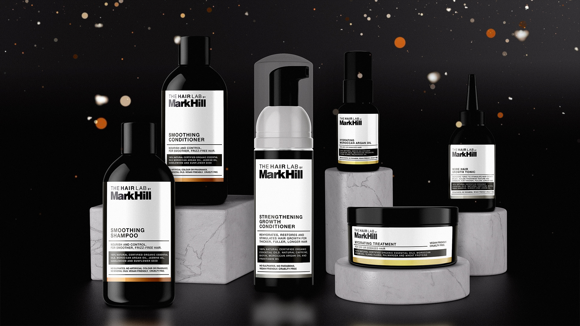
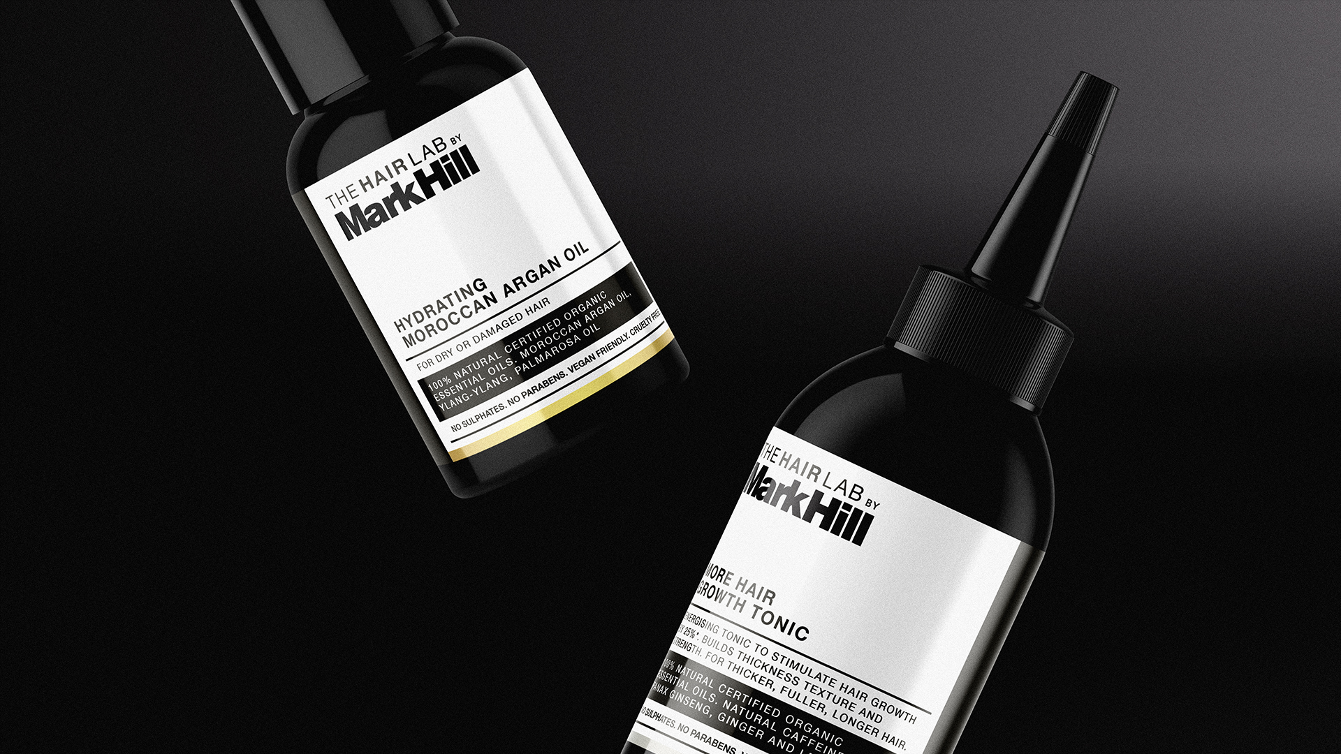
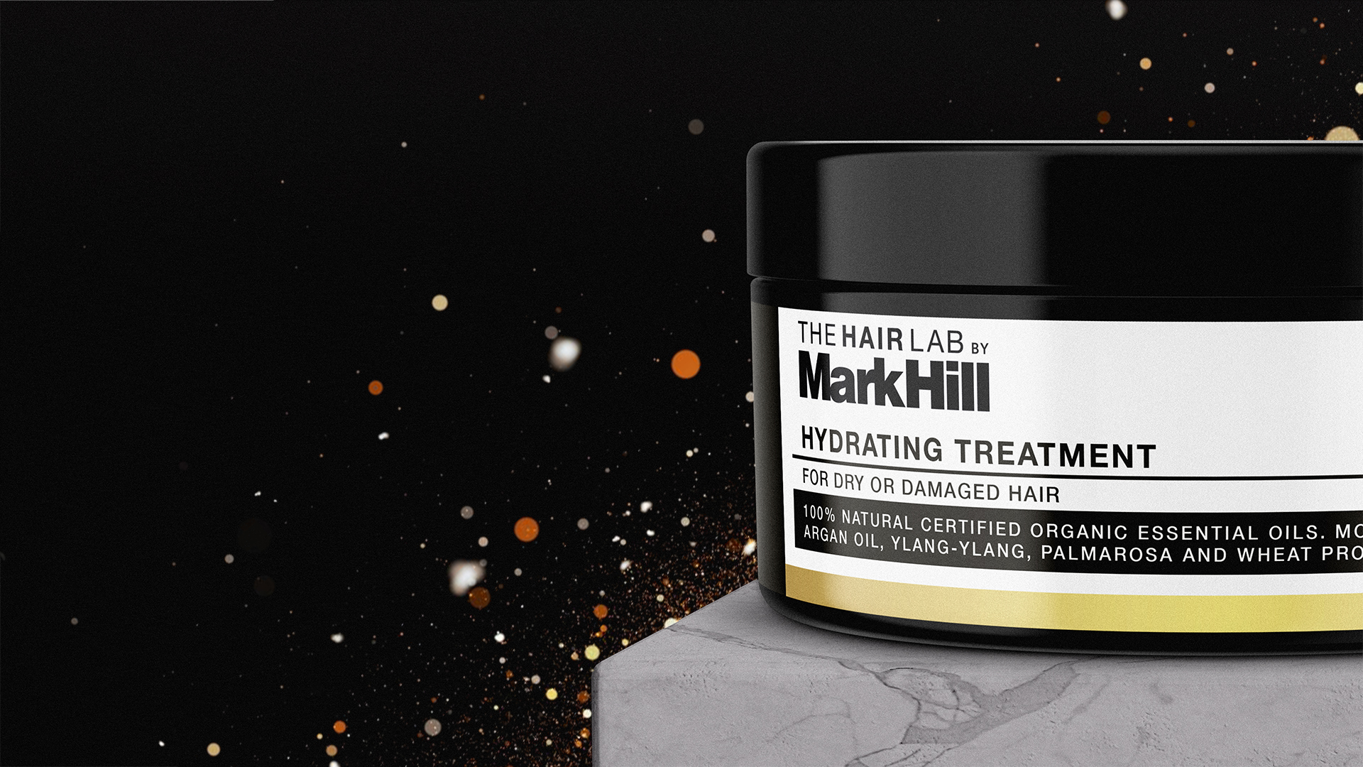
The HairLab range was a big step for the Mark Hill brand, with a new look and feel it had not had before. They now have a true premium offering with a price point to match.
