Modernising a household name

You only have to step foot in and have a quick glance around a Boots store to catch a glimpse of the brightly coloured pink and orange brand, Mark Hill.
Over the years Mark Hill they had become known for this vibrant colour palette along with their approach to being at the forefront of trends. We partnered with Mark Hill after winning a 3-way pitch in August 2018. The win was down to our sensitive approach to the existing brand and our research which revealed the valuable brand equity which Mark Hill had grown over the years. Our brief was to create a vision for the brand and new packaging designs that would modernise it and help create stronger bonds between the brand and their customers.

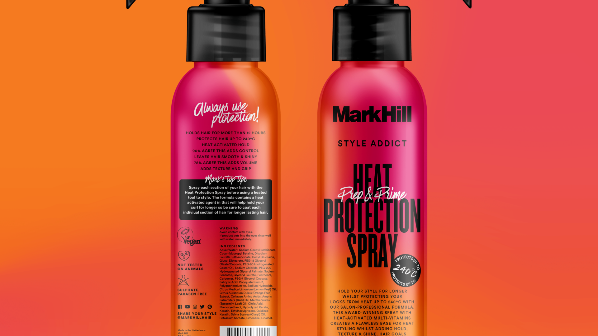
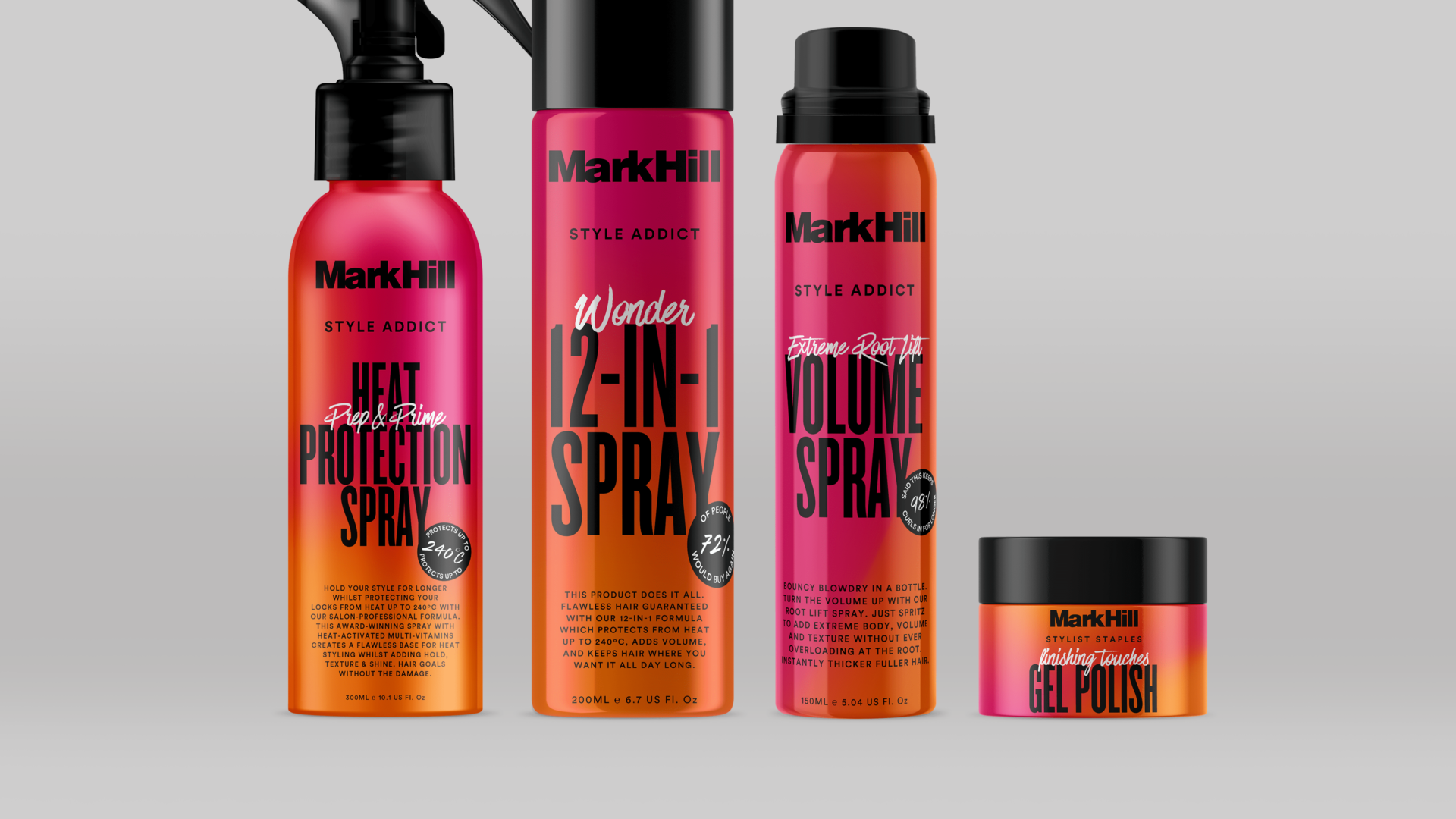
In this first showcase, we feature the Mark Hill Style Addict range, their everyday product range. We selected new colours and created a new way to use these, a new gradient/ombre style. We created a collection of fluid ombres that can be infinitely modified to give different flows of the same colours, bringing a more dynamic visual asset to their brand and packaging.
We then moved on to typography and the label systems. We set ourselves the challenge of creating a typographic label system that worked across differing sizes, formats and materials, but remained coherent and instantly recognisable on the shelf.


We worked with Mark Hill on helping them refine their tone of voice. We needed to keep in mind that just like trends, the language Mark Hill customers use is current and of the moment. This language has been developed to help speak to Mark Hill consumers in a casual and more engaging way.
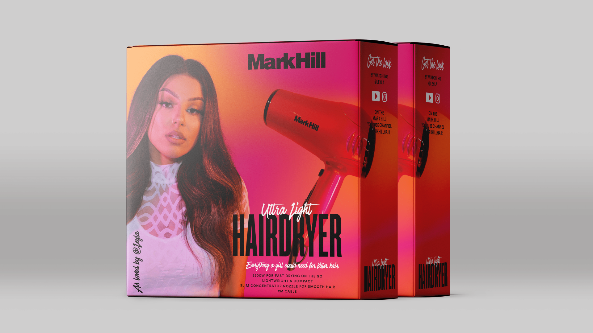
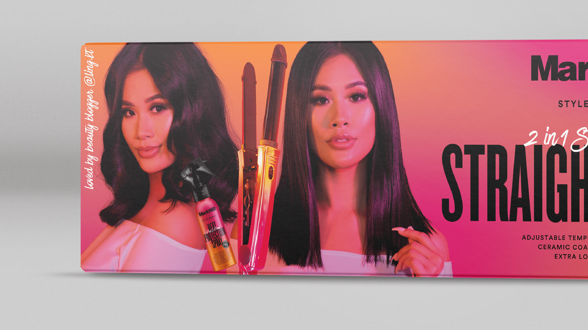
Being present at the influencer photoshoots allowed us to art direct the photography for the electrical packaging. We wanted to showcase the influencers that help Mark Hill further connect with their customers. We incorporated the new pink and orange colours into the lighting to help the photography have more of a visual connection with the rest of the brand assets.

Across all the ranges we have created a modernised look the existing brand, whilst simultaneously creating a strong, recognisable and easy to use brand/packaging system to help the Mark Hill brand create stronger bonds with new and future customers.


