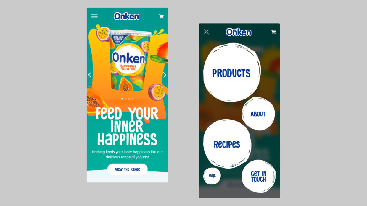
Bringing a brand to life online
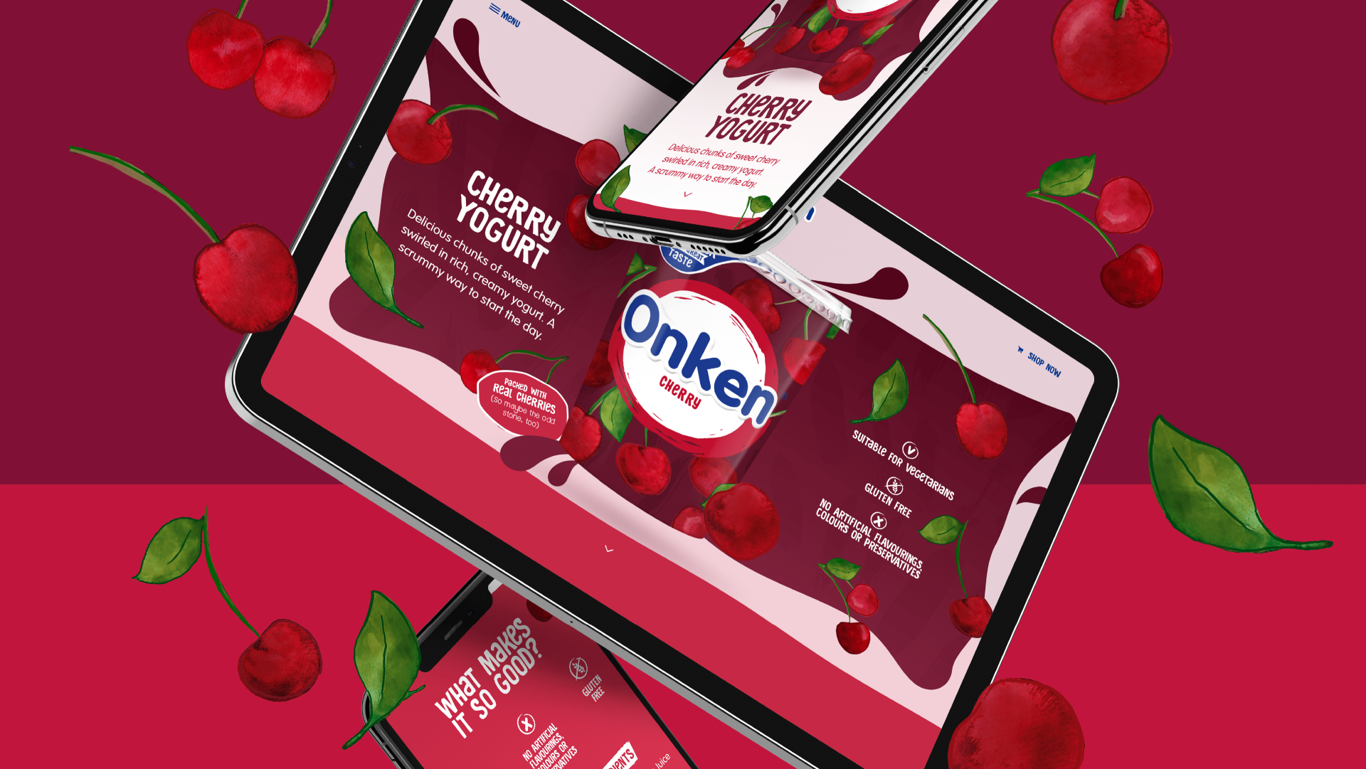
Onken have long been a staple in our fridges and after a redesign of their packaging, we were tasked with updating their online presence to match.
To bring the updated brand to life online, through a playful and bold website. Matching their newly launched packaging aesthetic, “feed your inner happiness” was the proposition that formed the starting point for our creative execution.
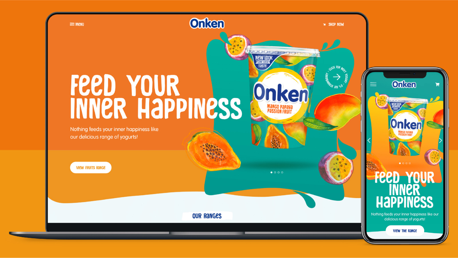
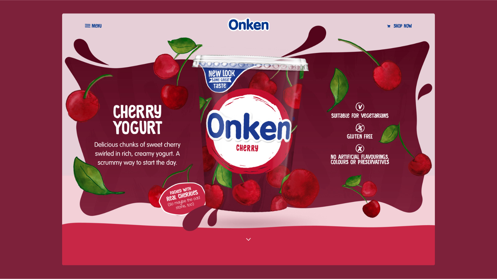
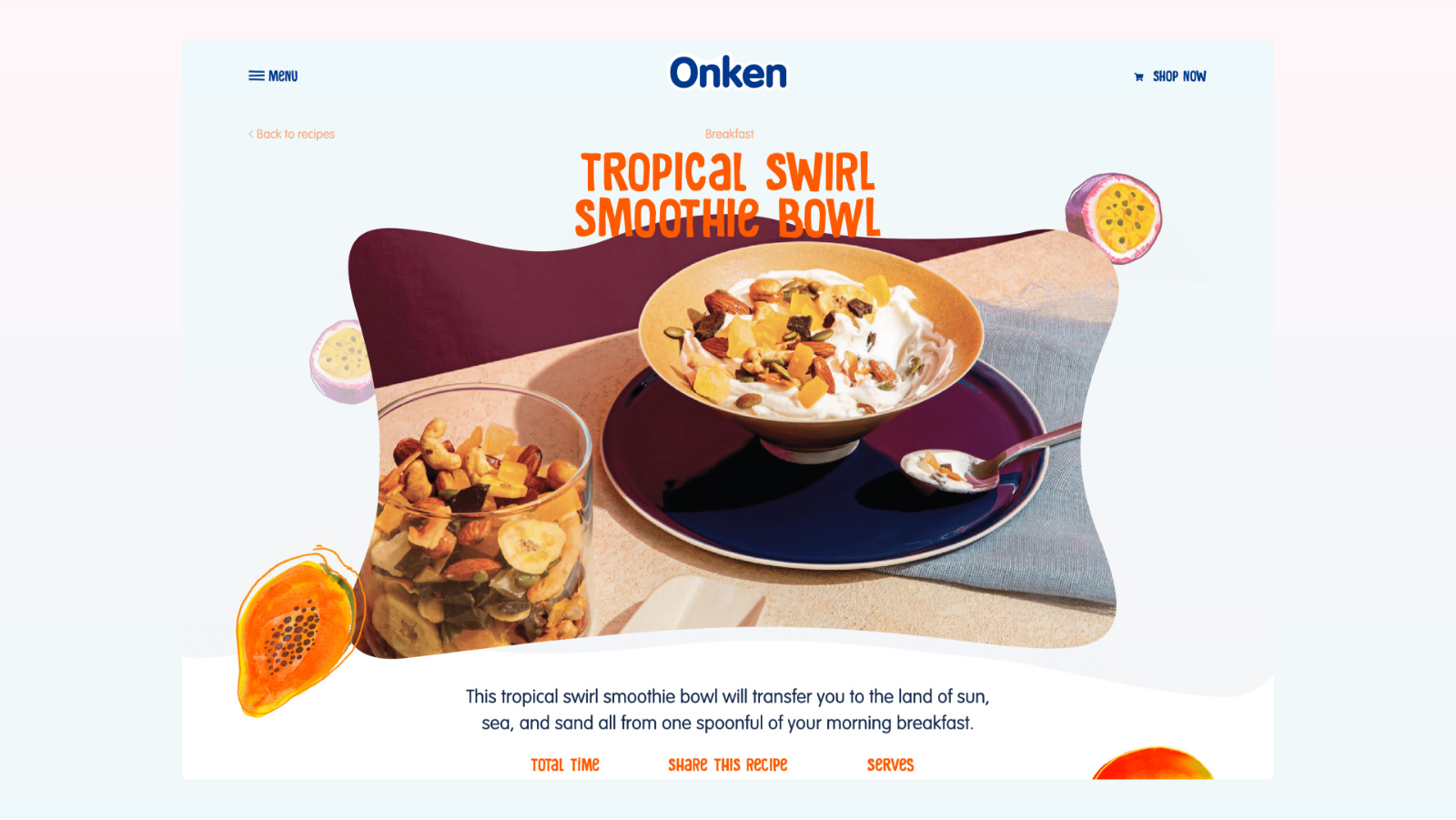
Taking the brand assets used on pack, the brilliant fruit illustrations, colours and textures, we created a website that came to life through animation. The real hero of the site (and the brand) is obviously the products, the yogurts themselves. Each product page on the site springs to life and explodes from the listing page. With the pot taking pride of place in every layout. As each yogurt and range is so different, (from fruits, to wholegrain and to naturals) each page uses a bespoke colour palette and illustrations to really push the individuality.

On mobile, all of the same great transitions that we used on desktop are still there, bringing the content to life, no matter what device the user is viewing the website on.
The real hero of the site (and the brand) is obviously the products, the yogurts themselves. Each product page on the site springs to life and explodes from the listing page. With the pot taking pride of place in every layout, following users down the page.
As each yogurt and range is so different, (from fruits, to wholegrain and to naturals) each page uses a bespoke colour palette and illustrations to really push the individuality.
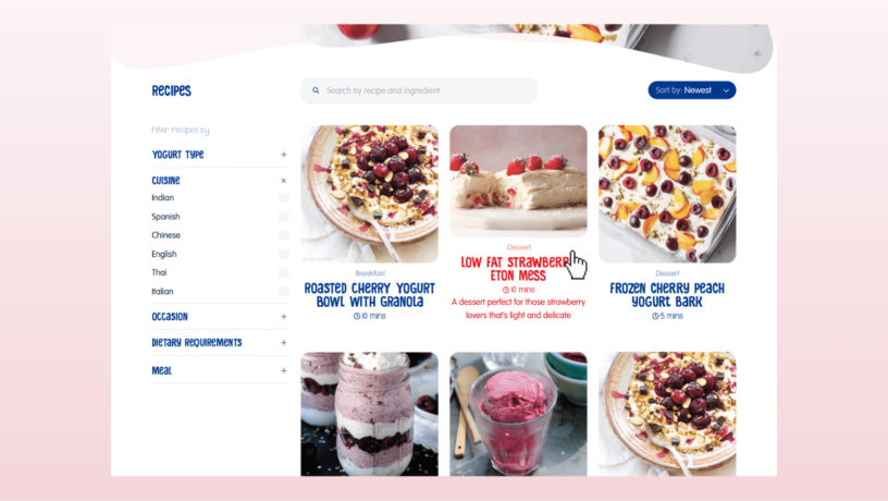
Recipe landing page with useful filters
“Aliquam sit amet eros fringilla, placerat turpis blandit, accumsan augue. Suspendisse lobortis ut nisi et vehicula. Ut vitae consequat quam. Aliquam metus mauris, aliquam in feugiat eget, scelerisque at dolor.”
Stefanie CallimanisUK Brand Manager


