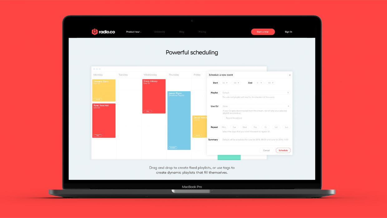
A class leading web-presence for a class leading radio platform
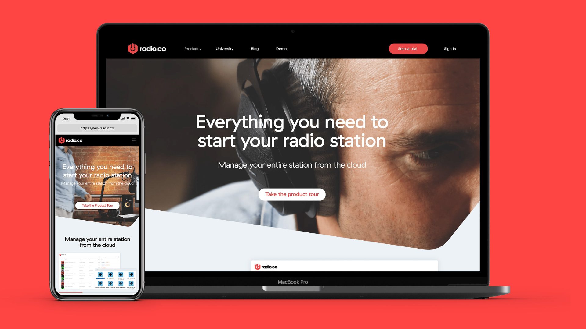
Radio.co is a complete and browser-based radio station management system, giving you everything you need to start and run a radio station. Built from the ground up right here in Manchester, Radio.co is designed to be every bit as invaluable to industry veterans as it is to complete newcomers.
The Radio.co platform had been running successfully for a number of years, establishing the Radio.co brand as industry leading in a surprisingly short time. The time was right to refine the brand and reflect this more authoritative, premium positioning, while simplifying the over-engineered site navigation and emphasising the platform's product tour.
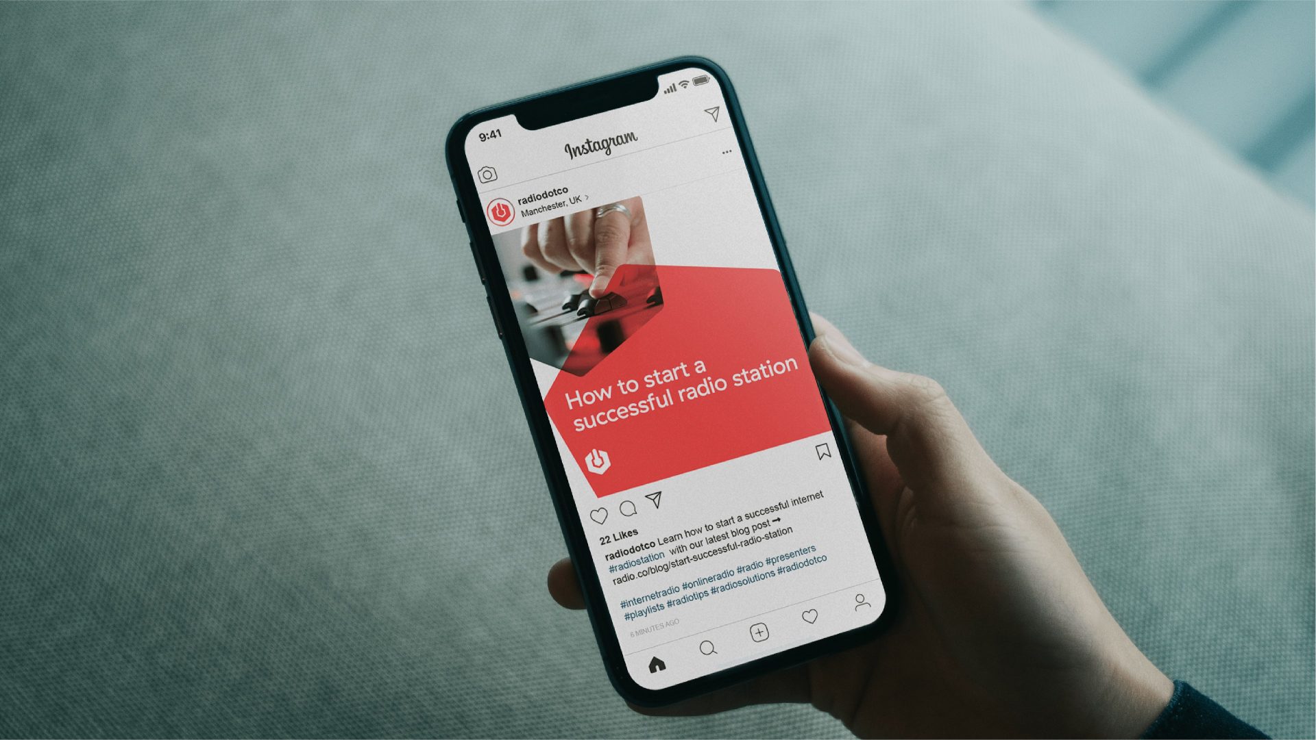
Refining the Radio.co brand identity to create a more premium look and feel was our first move in this project. We simplified and refined the marque, added new type styles and an extended colour palette alongside recognisable brand assets to give the visual identity more depth and adaptability across the many touchpoints and channels that Radio.co can be seen on. Our new brand manual featured a new photography style, one that was much more in keeping with how the brand needed to be positioned in order to appeal to its diverse target markets.


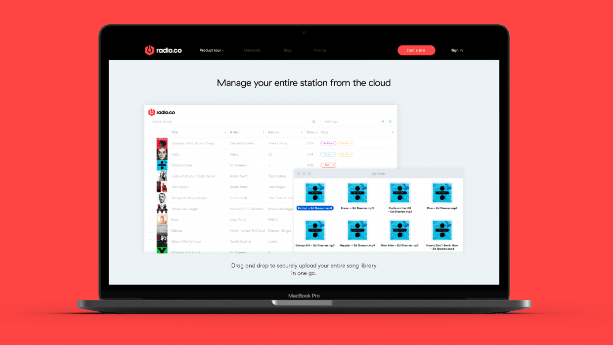
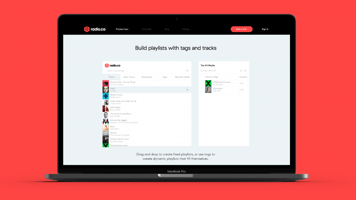
Perhaps the main part of this project was the product tour. We needed a site design that funnelled users into the product tour sooner rather than later, leaving them in no doubt as to what the Radio.co platform does, and just how powerful it is. Taking a look at some of the internet’s best product tours, we noticed that the original Radio.co product tour featured many more sections and almost twice the amount of copy as those of the industry leaders. The copy had also been created by technically-minded staff, very close to the platform, meaning it said everything it needed to, but not as efficiently or impact fully as it could. It undersold the power of Radio.co's offering, pitching it as a good starting point for internet radio stations, and not a complete solution. With overhauled copy at the heart of the product tour, supported with animations to illustrate individual pieces of powerful functionality, the end result tells you everything you need to know about Radio.co at an engaging, measured pace.
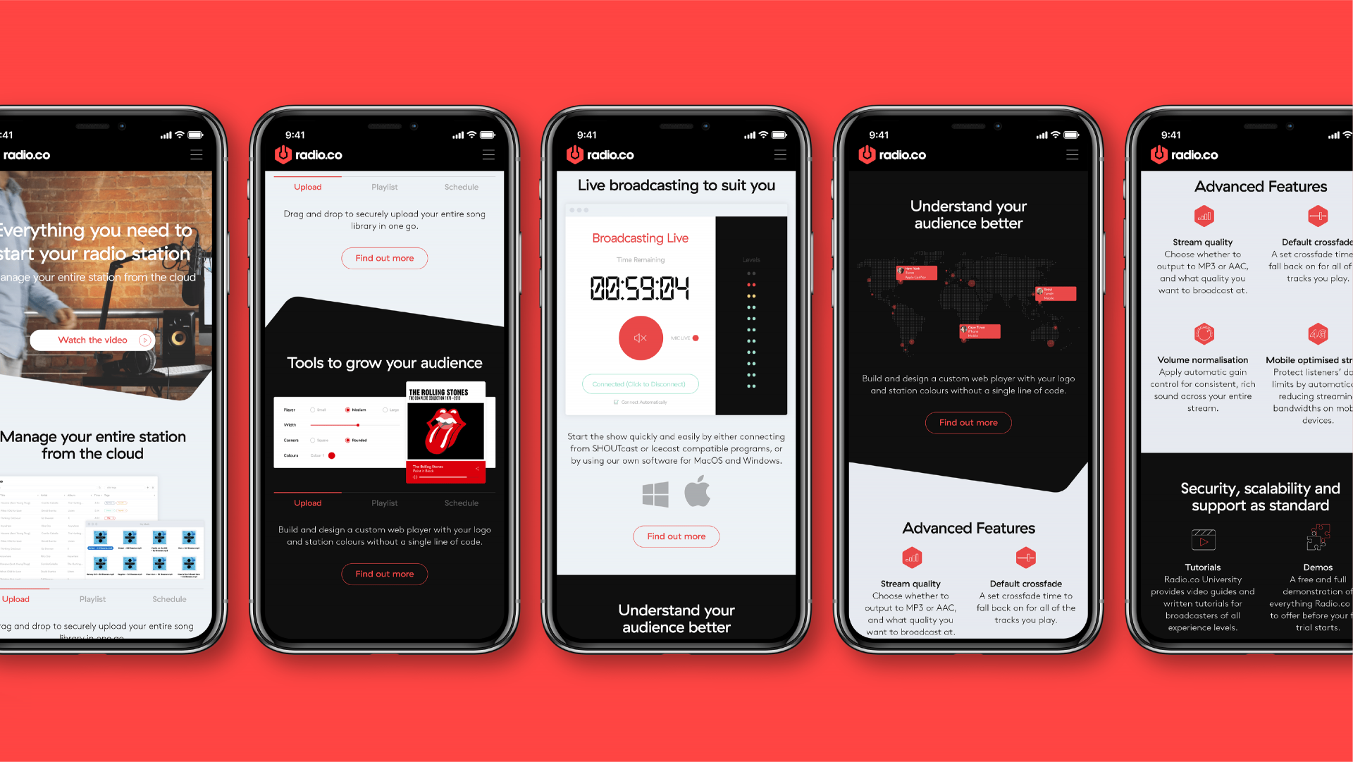
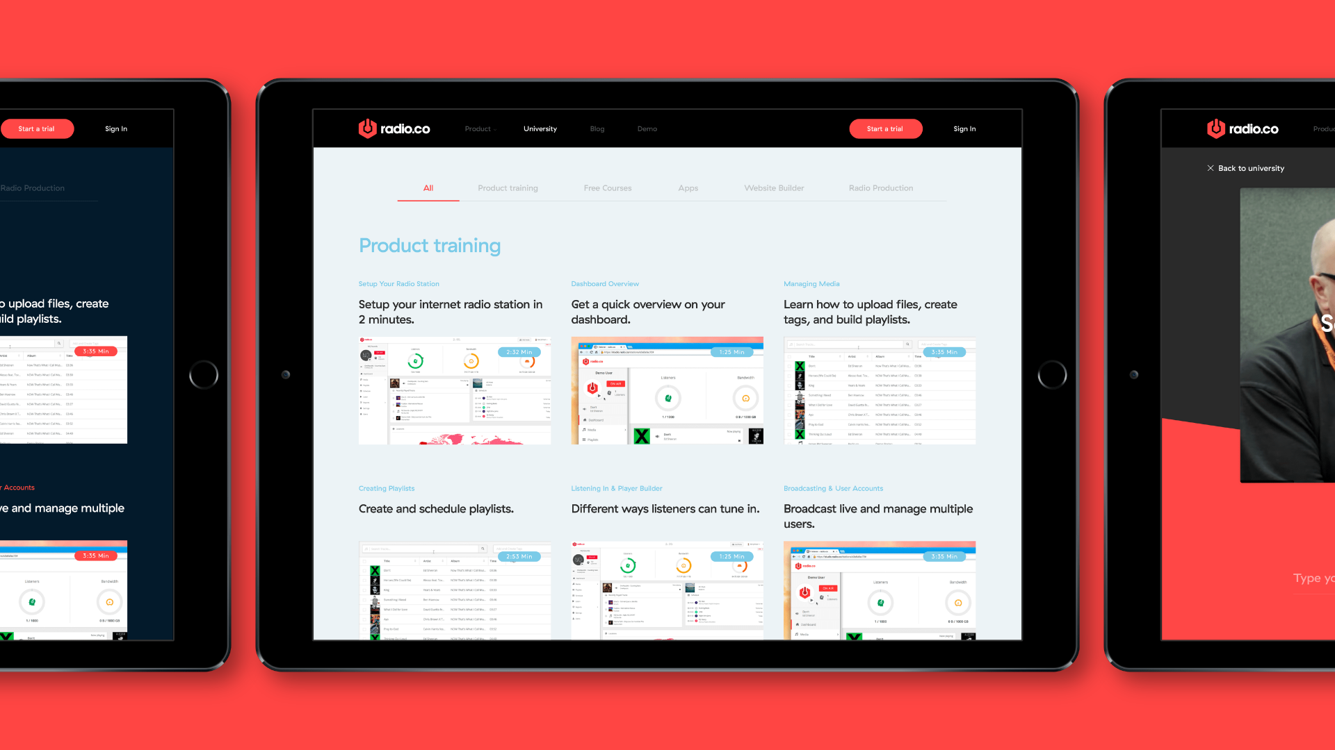
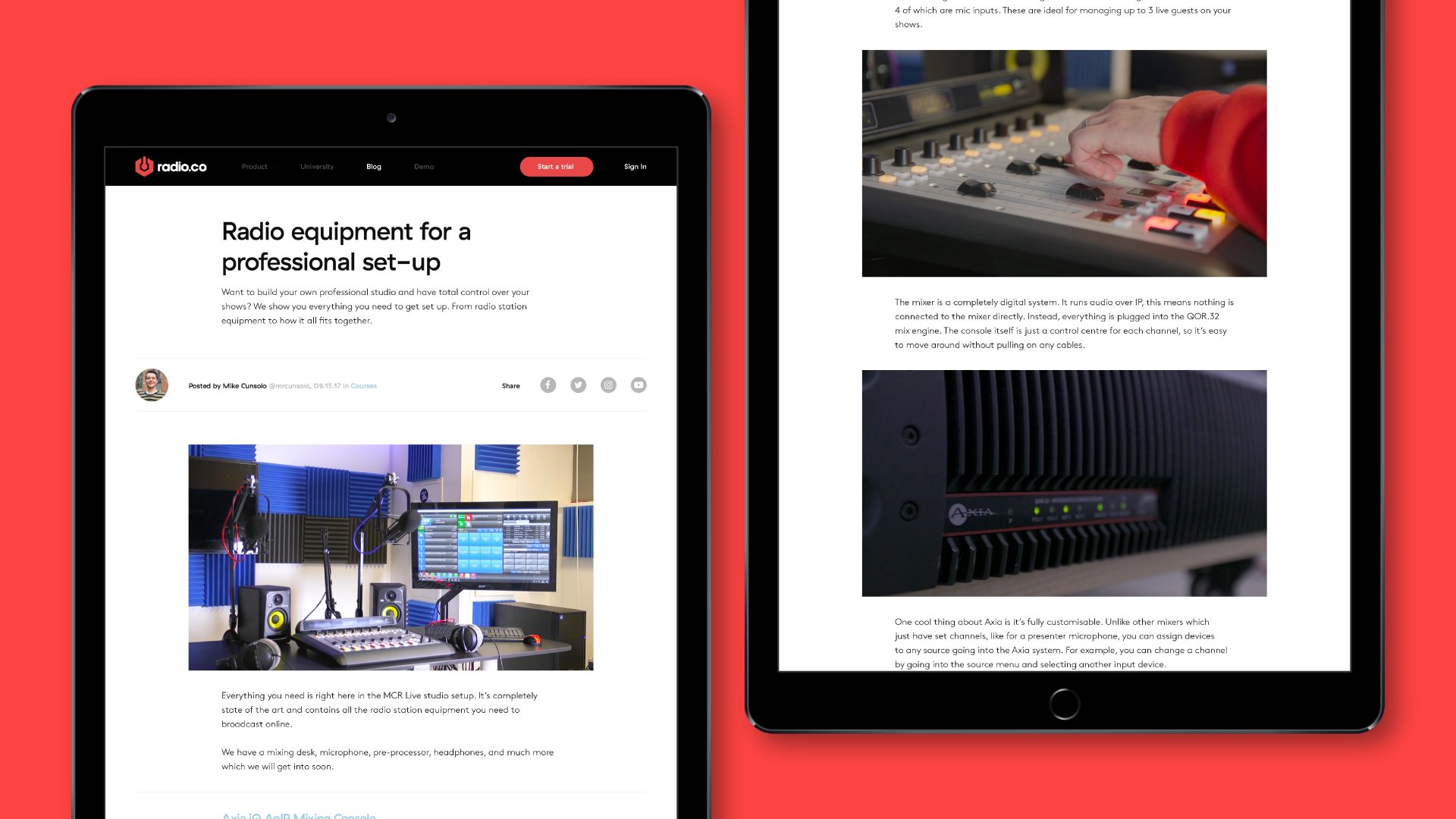
The rest of the website serves two purposes, firstly to educate new or experienced radio DJs or station owners through the content-rich University and Blog sections, and secondly to educate them about the product. Throughout the website we looked to get across how the Radio.co platform is even more feature-rich than its competition, but still the strongest possible starting point for budding radio DJs. Guides and product training are readily accessible in our new design, with an ever-present "free trial" call-to-action for prospective users that would rather try out Radio.co for themselves.
