A unique fitness experience
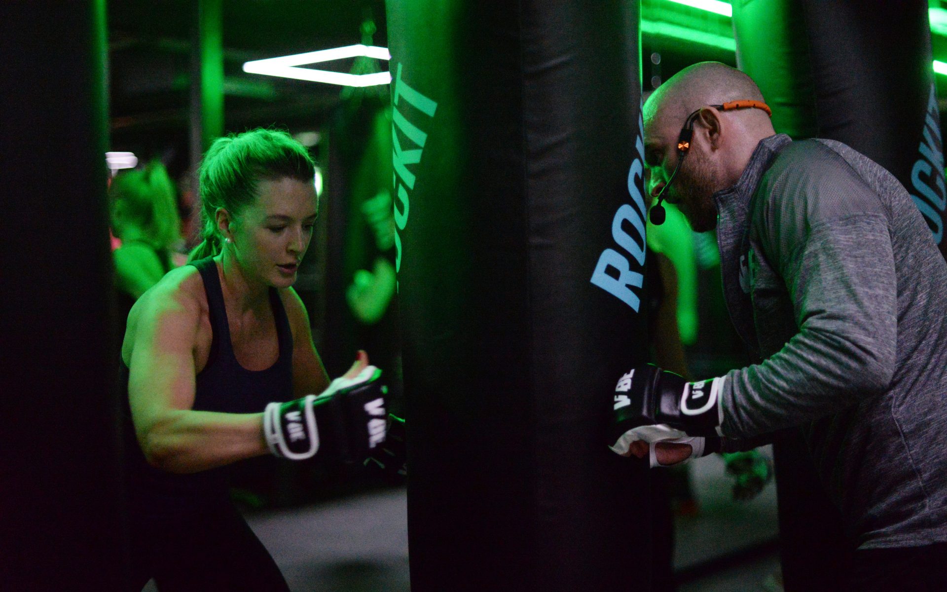
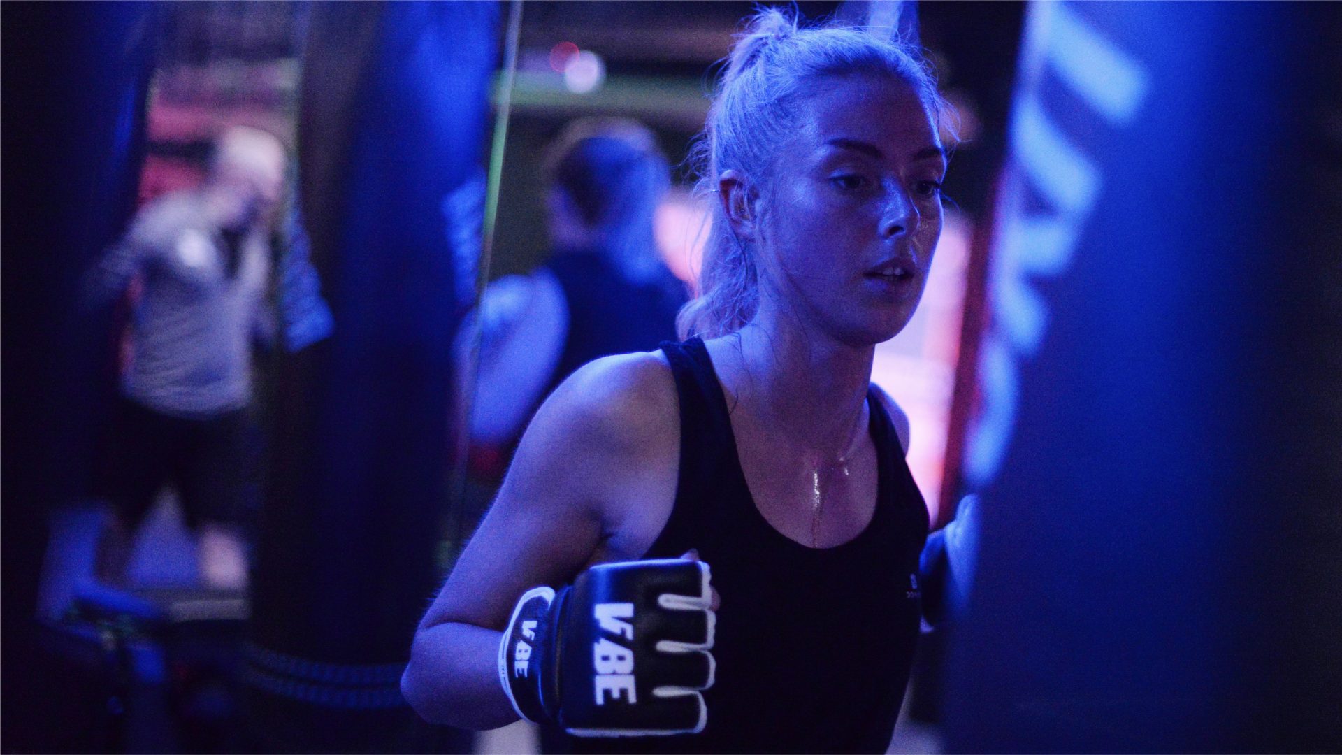
V1BE is a fitness experience unlike any other, a studio environment with a pay-as-you-train model and intense 30-40 minute guided HIIT workouts led by passionate, charismatic trainers.
Sure to be the next big thing in fitness, V1BE’s premise is all-new, something regular gym goers have been crying out for as an alternative to the halfhearted classes included in their memberships. Such a novel proposition needed an equally ambitious identity and website to support it. We tasked ourselves with creating a brand that blended fashion and lifestyle influence with fitness and self improvement.
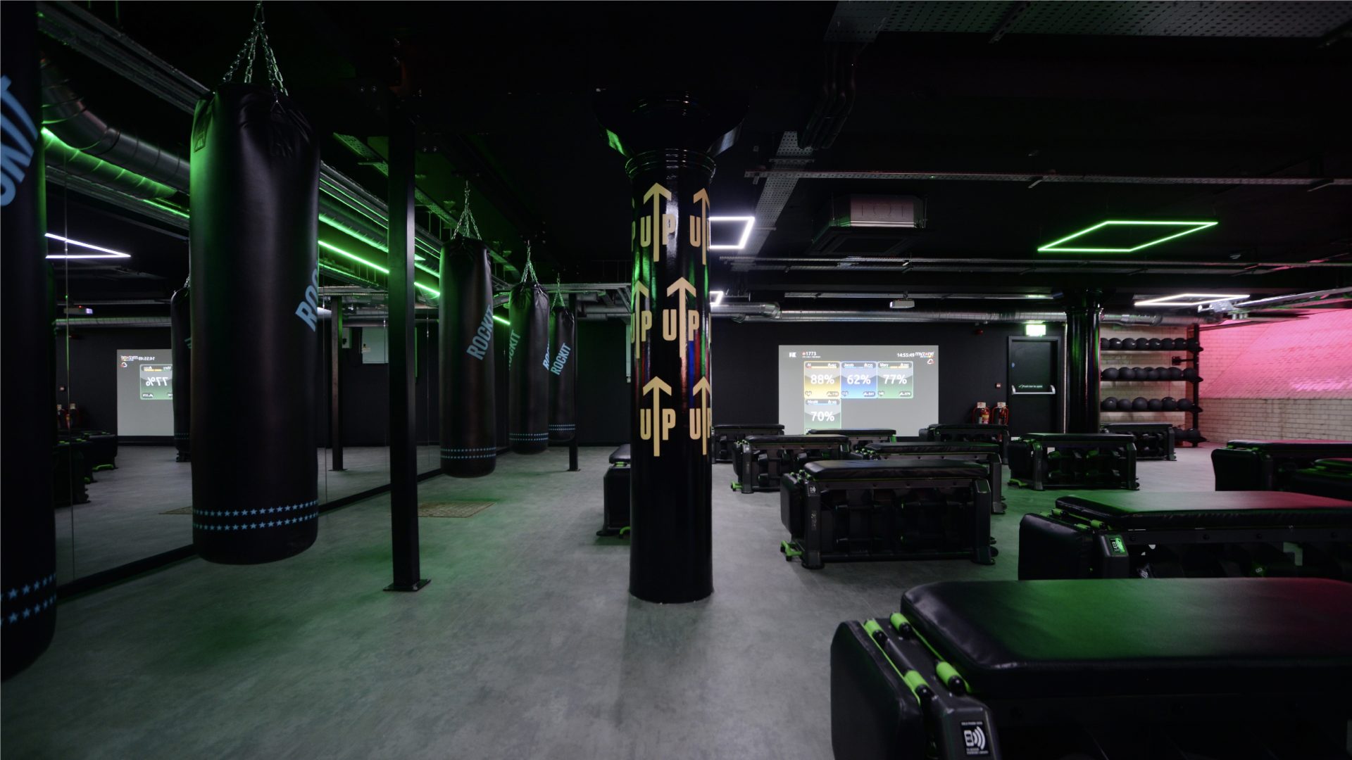
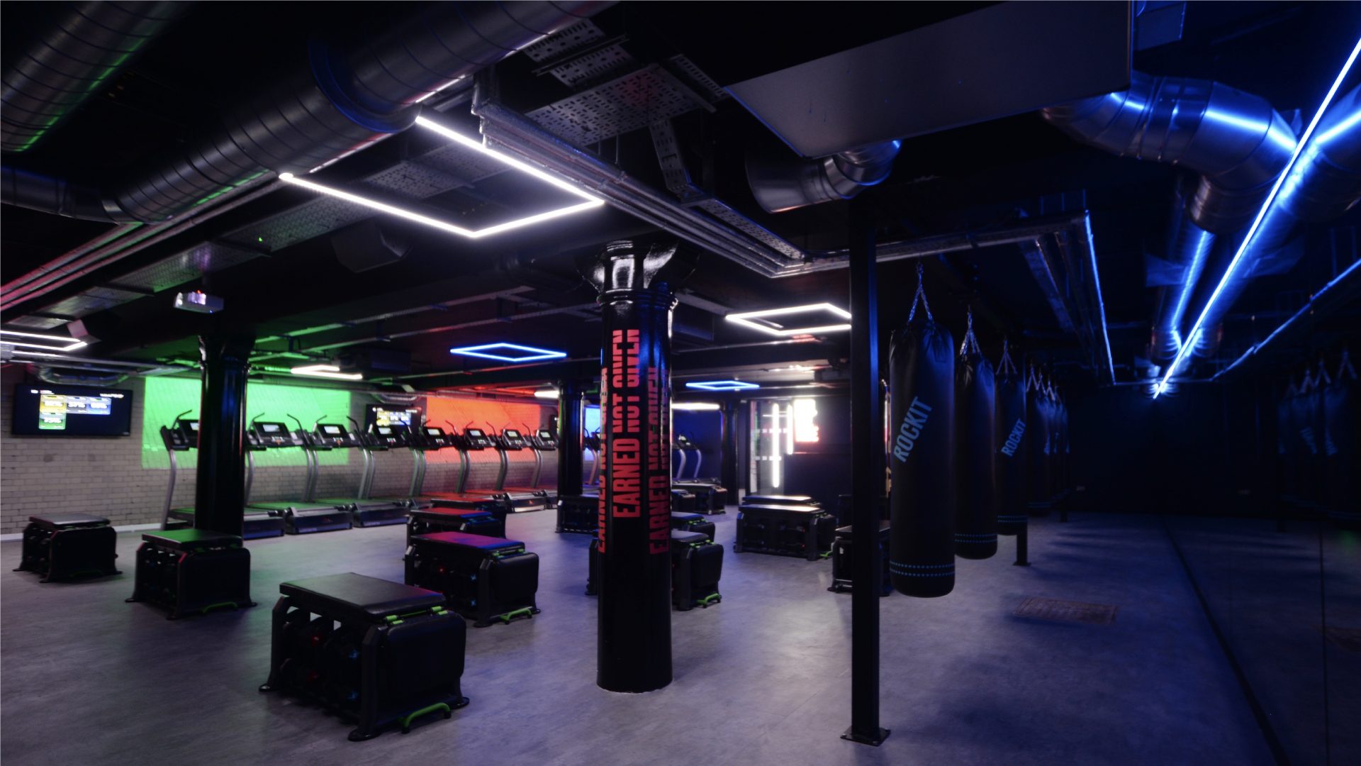
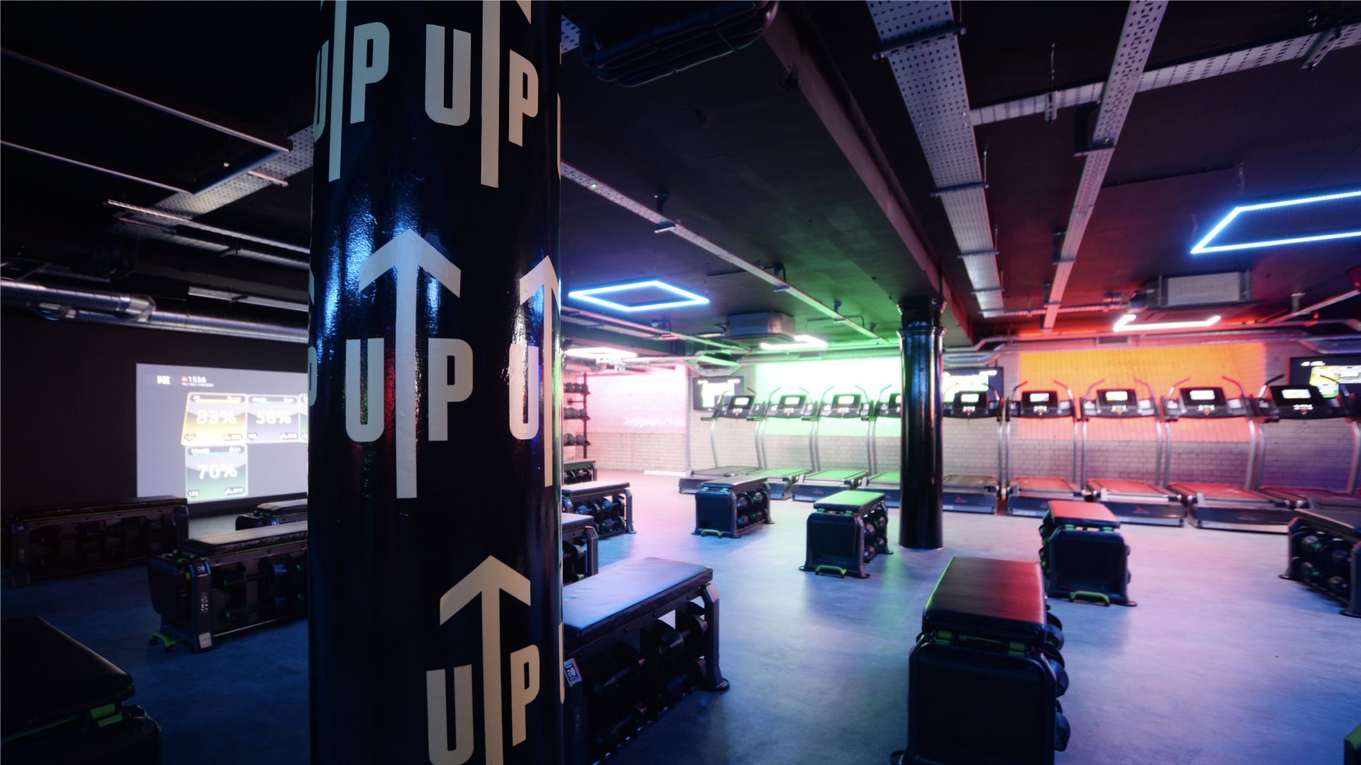
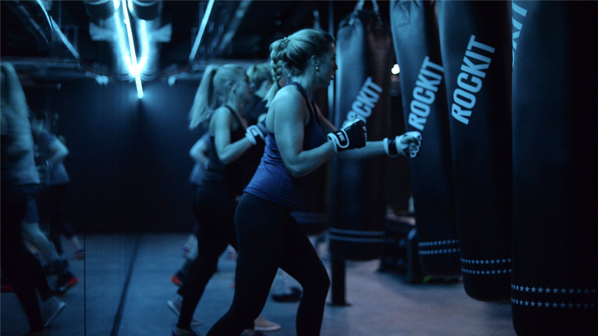
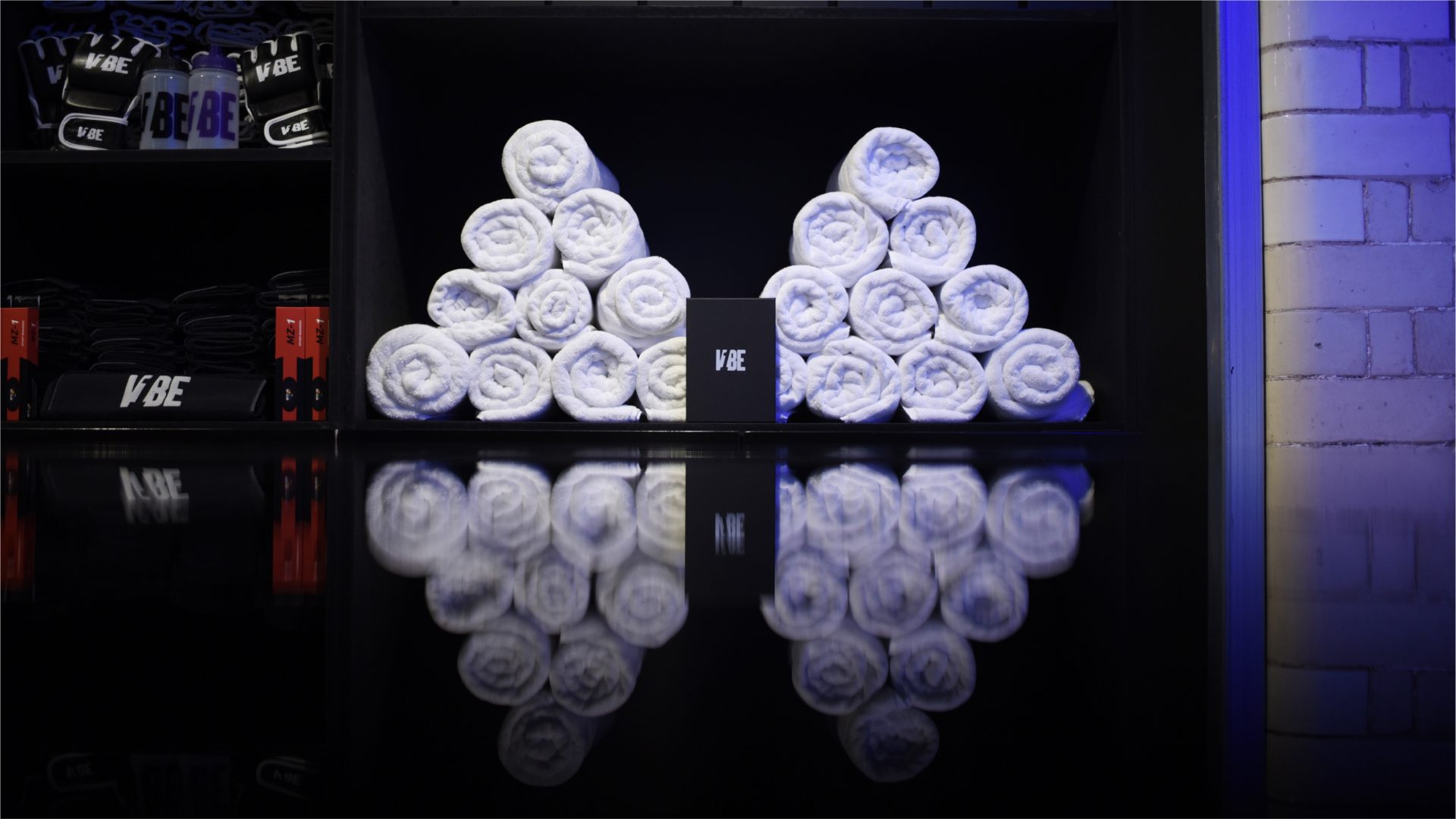
First V1BE gym fit out. NQ Manchester.
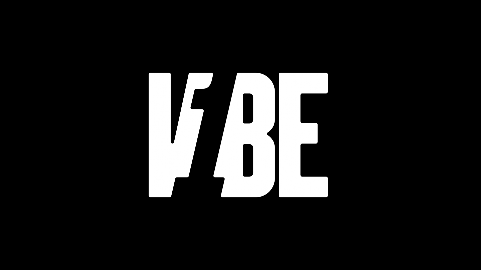
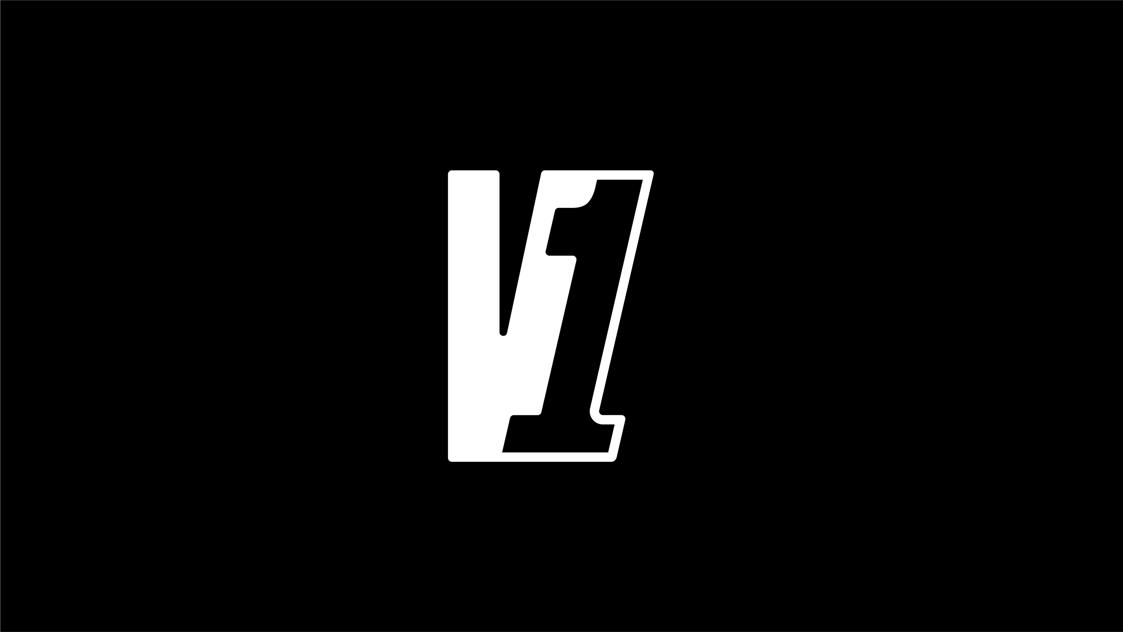
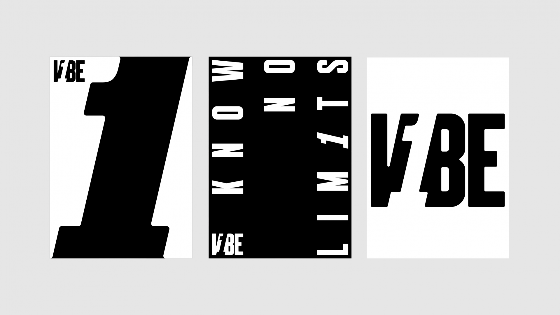
We created negative space to bring focus to the number one. Their point of difference in their name and the focus on you.

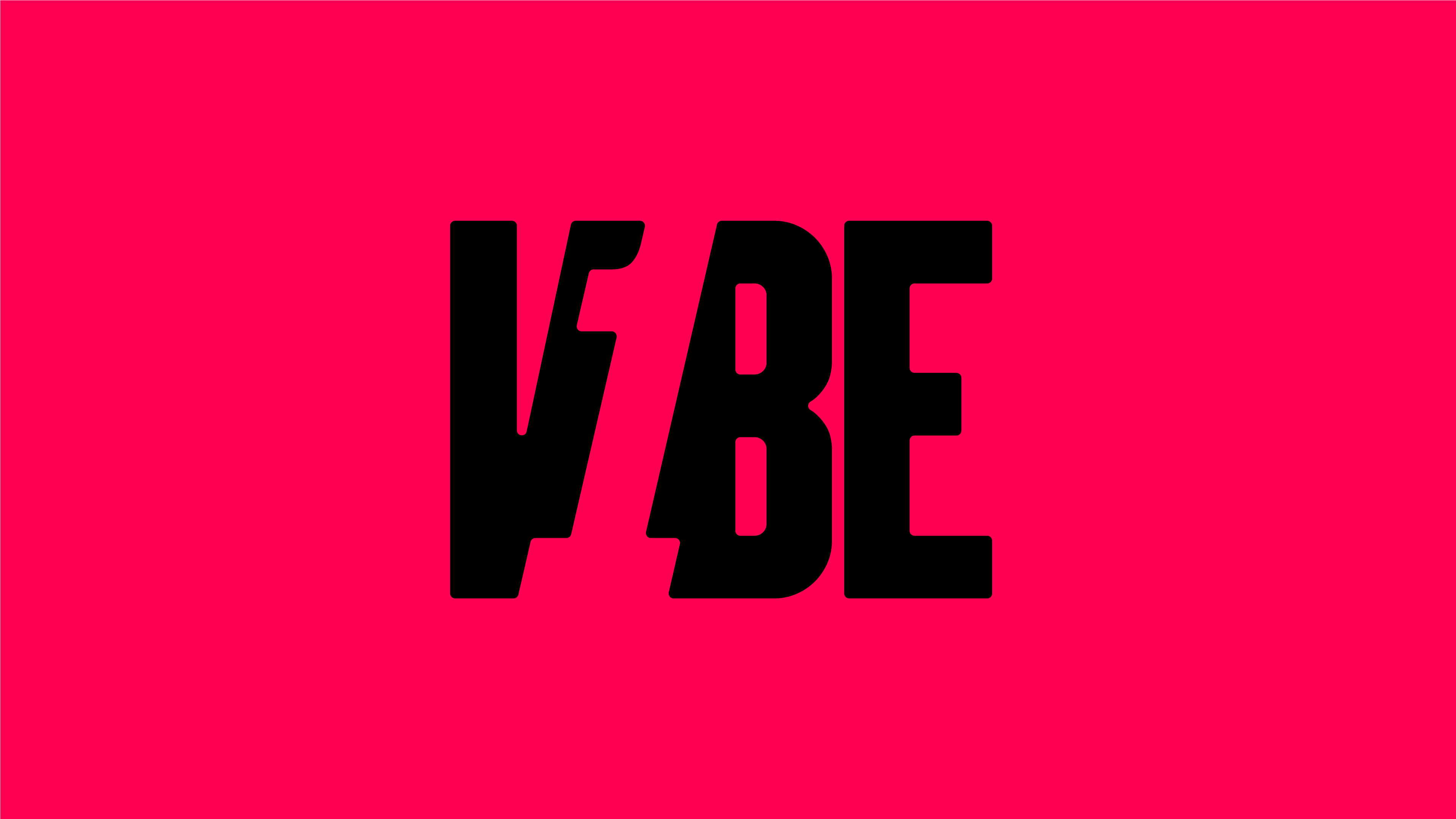

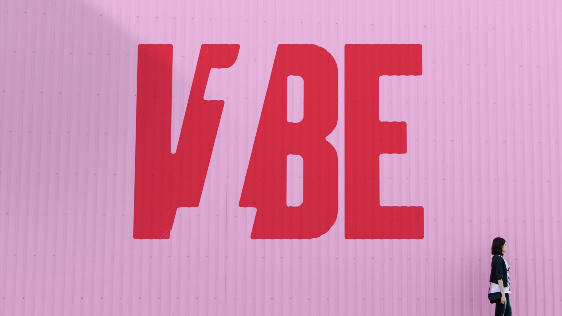
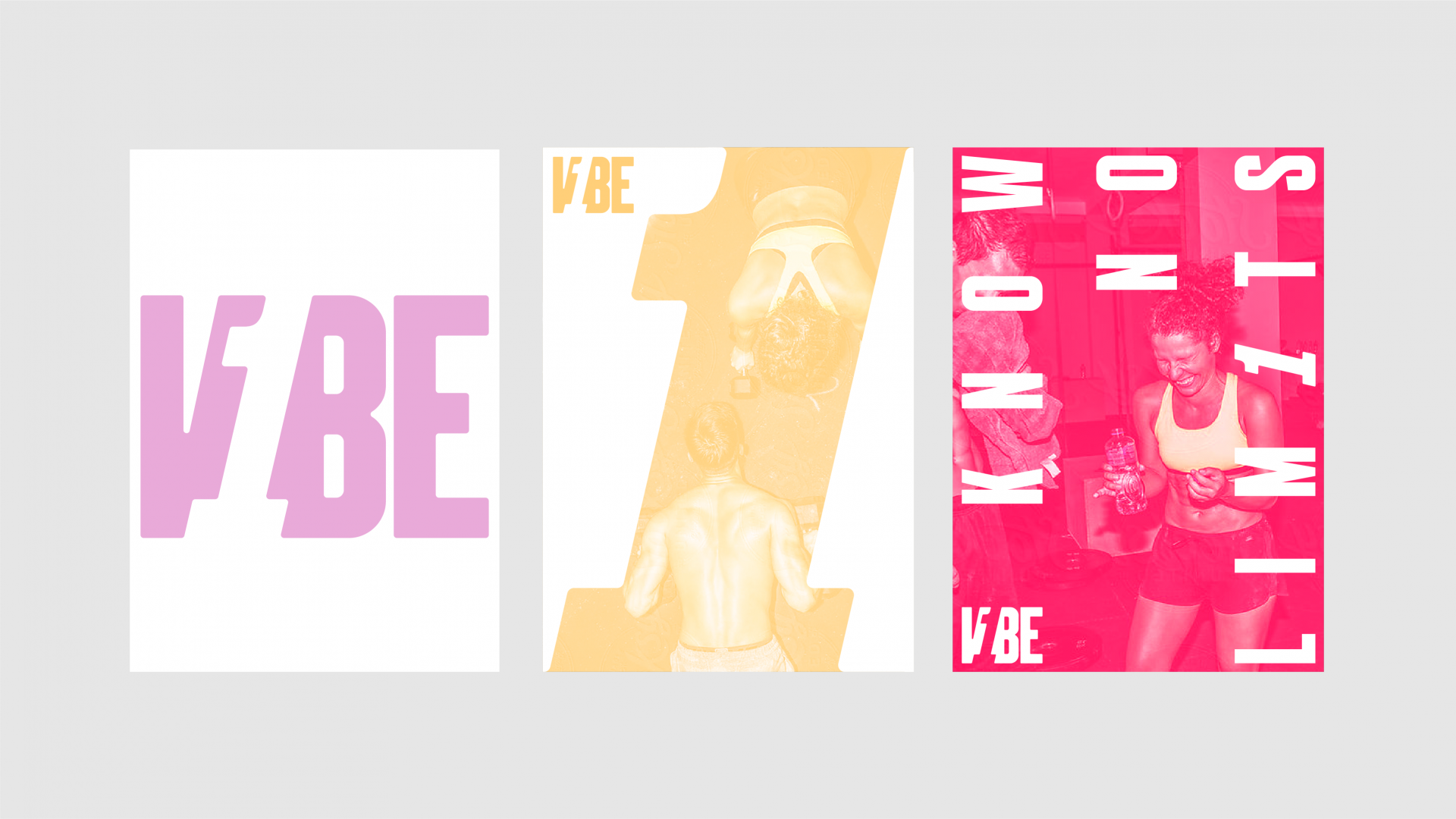
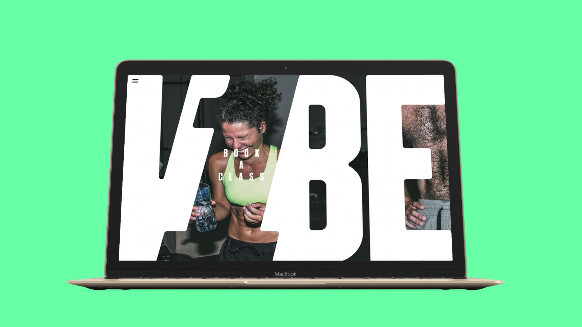
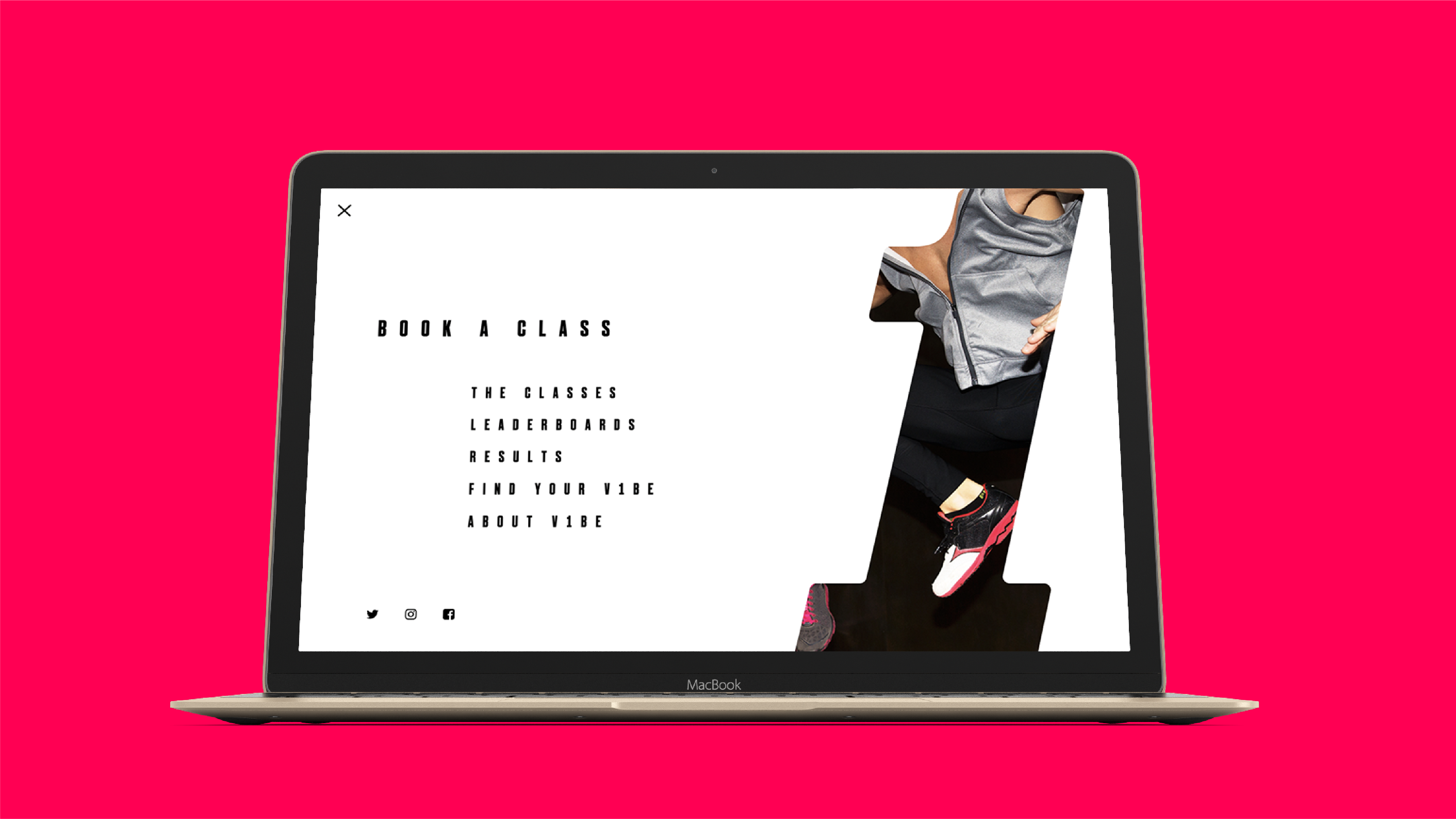
As is the way of things at BGN, we started by defining the strategy behind the brand – bringing together the thoughts of V1BE’s founders and combining them with our own to arrive at a clearly defined proposition, vision, series of brand values and tone of voice to make sure that V1BE gets the best possible start. From here, we could move to design the identity, a process which started with the name, or rather, its unique spelling. The numeral one presented us with an opportunity – rather than blending the one in with the letters so that it was practically indistinguishable from them, we decided to the exact opposite, italicising it and recreating it in the negative space between the V and B. In doing so, we create a striking asset, making the 1 a hero that we can reuse across messaging, or even as an abstract framing device to brand images without needing to show the wordmarque.
As for the colour palette, though we primarily lead with a stripped-back black and white, aligning V1BE more with fashion than fitness, but supporting that primary palette with three light and three dark colours to convey the vibrant and energetic nature of both the V1BE studio environment, and the classes they offer day in, day out.
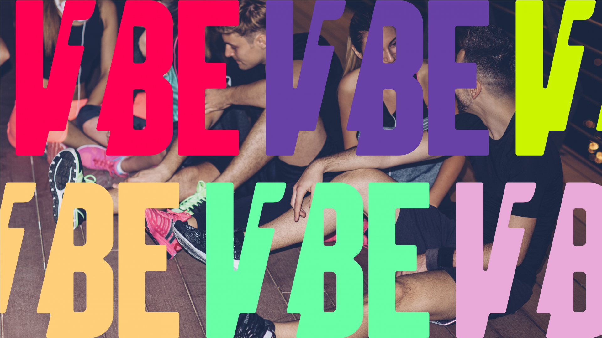
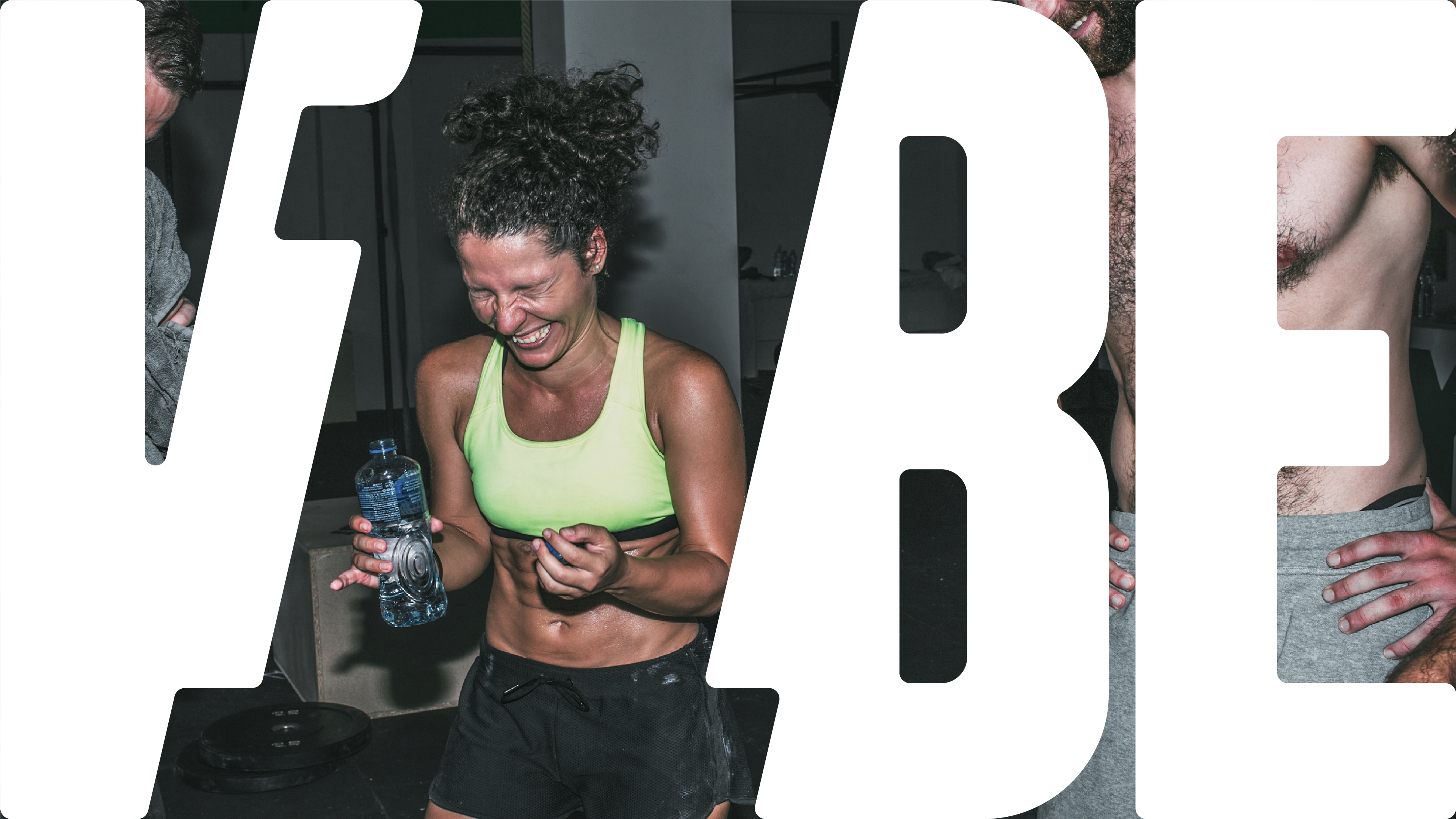





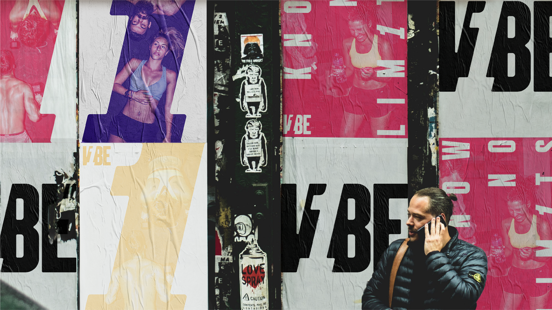
Perhaps the easiest way to get an impression of the V1BE brand is to visit their website, which we designed and developed with subtle animations making a greater feature of the negative space one, sliding aside to make way for copy, but never overusing this flourish. Better still, you can go for your first class free of charge, seeing our identity applied throughout the studio as you experience everything that makes V1BE unique in just one class. Just one taste, and you’ll never settle for anything less.
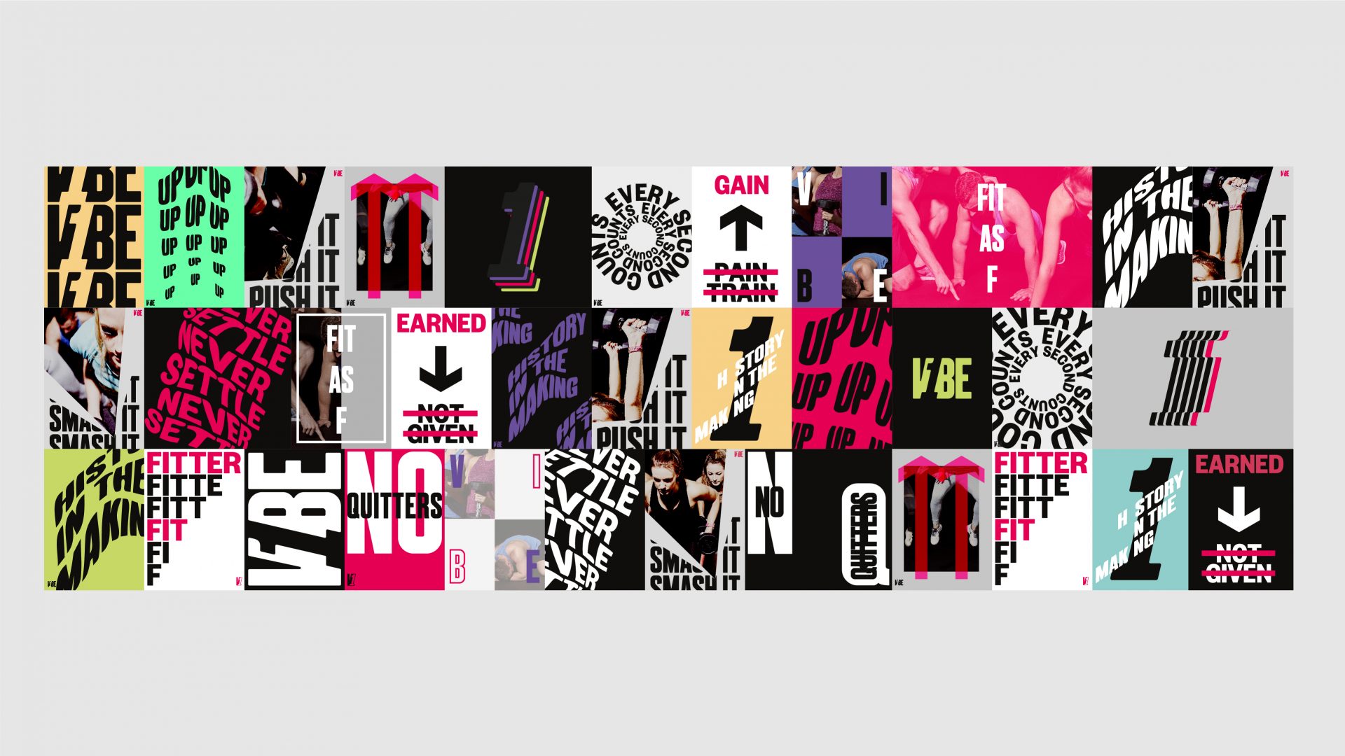
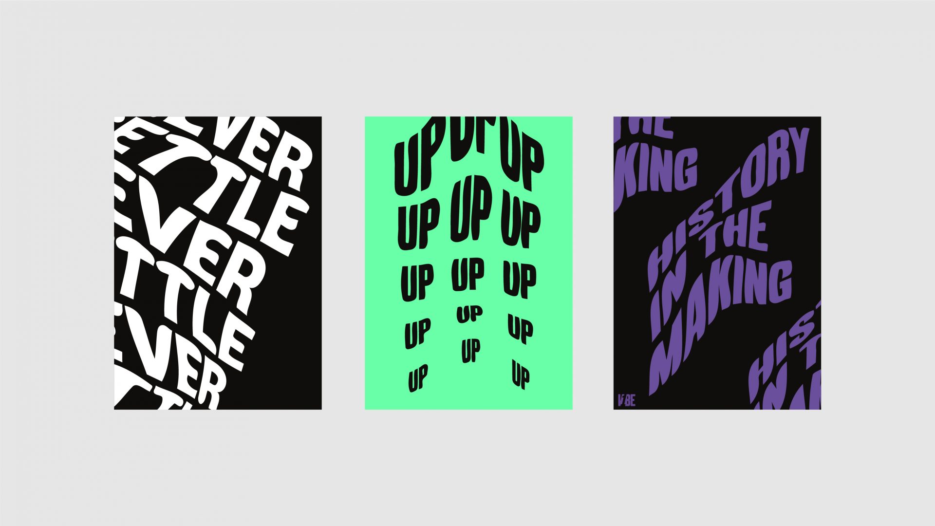
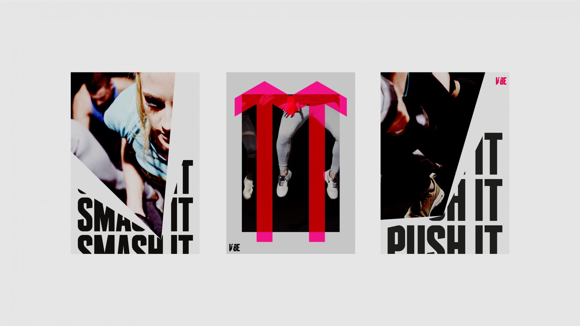
We created a wall of inspirational posters, all in the style of the V1BE brand - adding depth and interest.


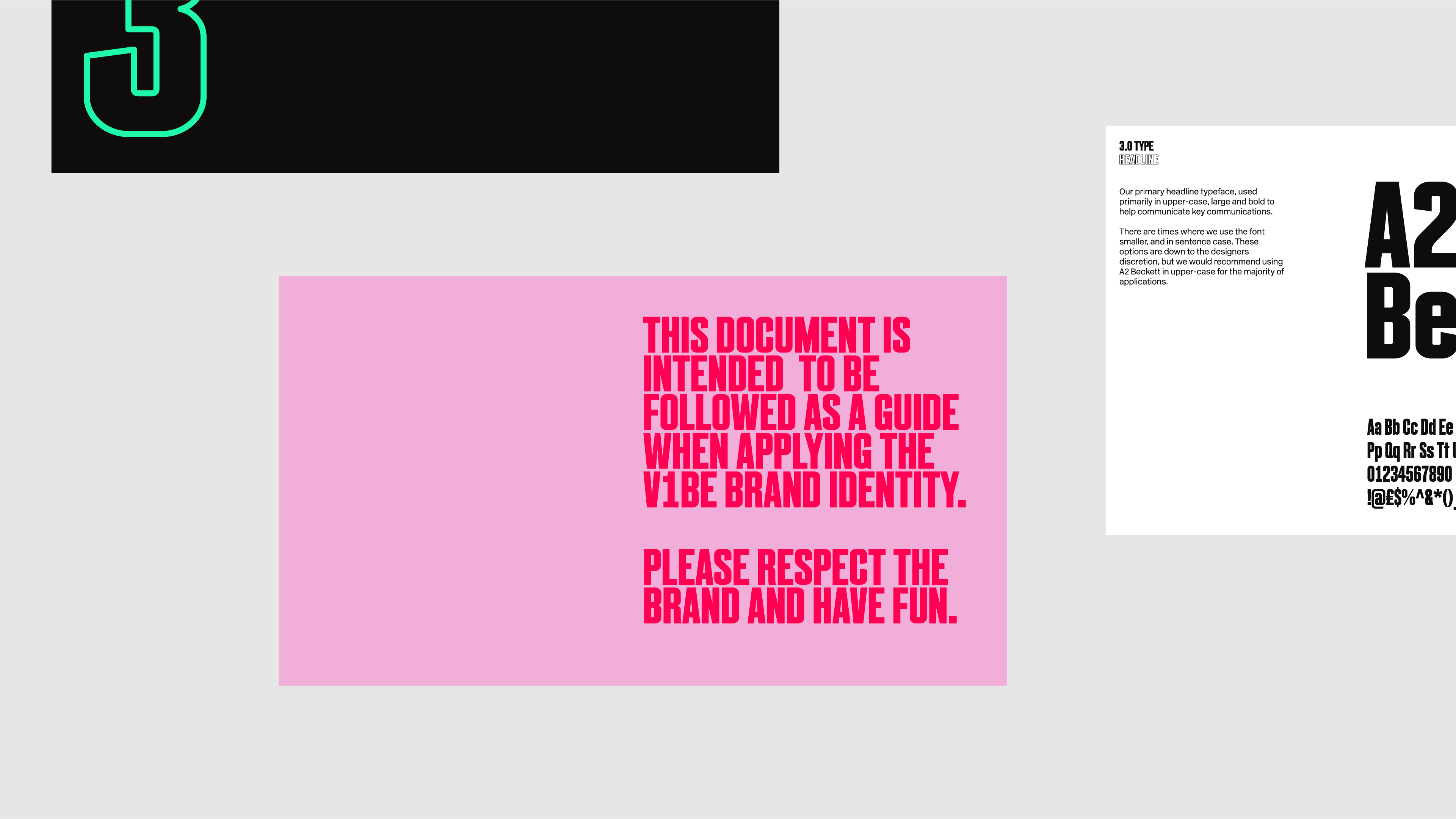



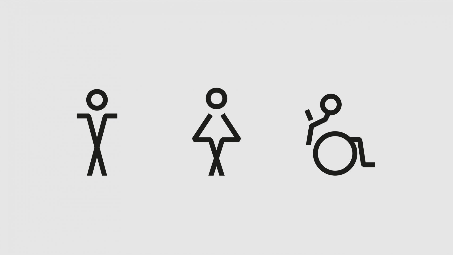
We designed a suite of wayfinding icons - helping with the ease of roll-out in other locations.
